Conseil
Calls to action that make people act
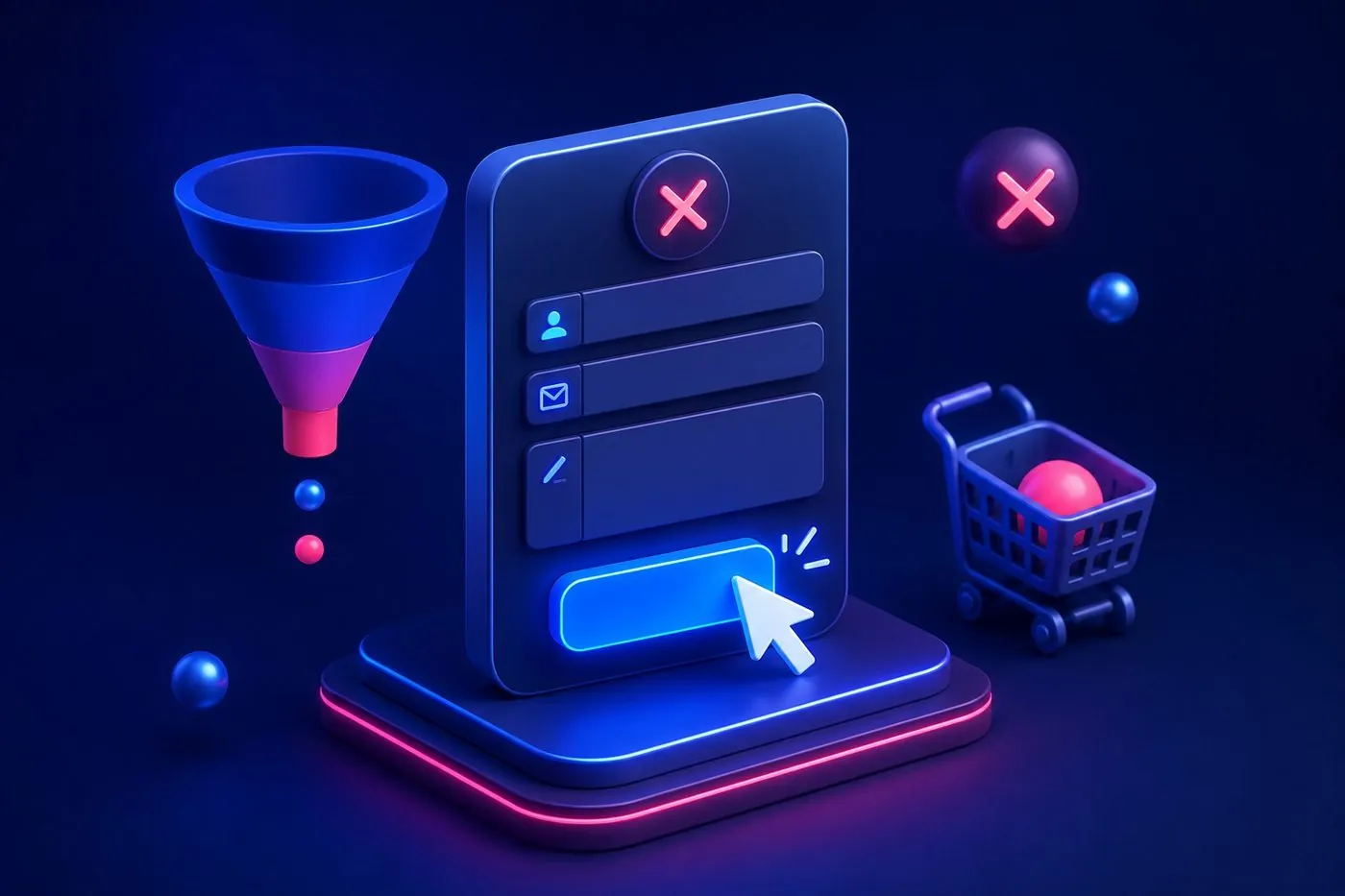
A site without a clear call to action is like a shop without a checkout. The CTA guides the visitor toward the next step: call, request a quote, book.

An action verb, a benefit
"Get my free quote" is stronger than "Send". Say what the visitor gets, not what they have to do.
Visible and repeated
The main button should stand out (contrasting color) and appear at the top of the page and again lower down. A visitor should never have to search for how to contact you.
Reassure right next to it
"Free · No commitment · Reply within 24h" under the button removes the last hesitations.
Skywebis answers your calls, books appointments and prospects for you, connected to your website and software.
Discover our call centerFrequently asked questions
How many CTAs per page?
One main objective, repeated. Too many different choices paralyze the visitor.
What color for the button?
A color that contrasts with the rest of the page to catch the eye.


A website project?
Skywebis builds your custom site, no forced subscription. Free quote, reply within 24h.